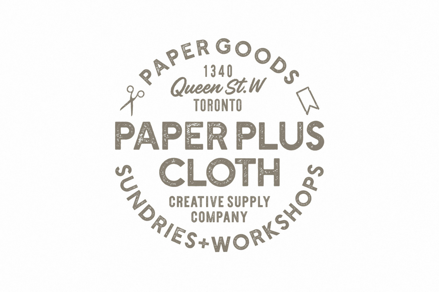
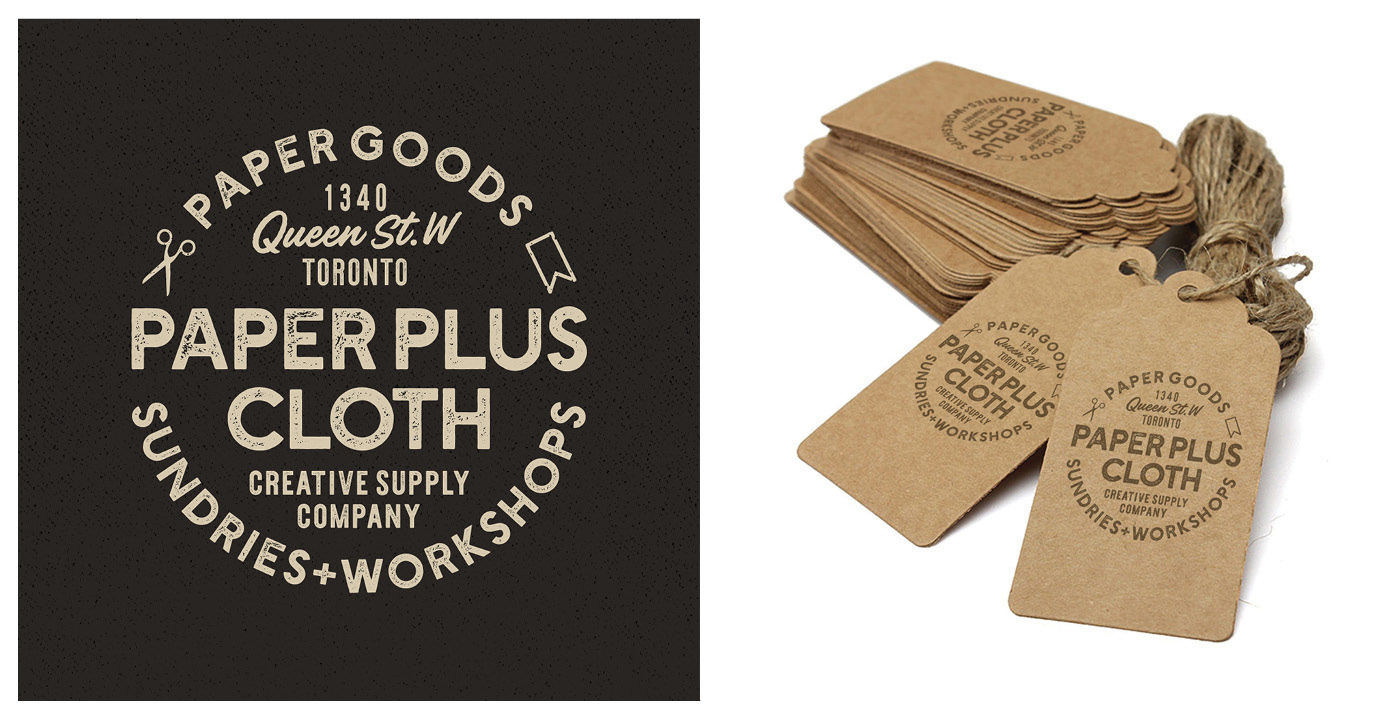
Paper Plus Cloth, an online retailer headquartered in Toronto, specializes in rare Japanese Washi tapes and stationery goods. The owner sought to revamp the storefront image and desired a logo embodying the vintage and hand-crafted aesthetic while serving as a versatile stamp seal for branding packaging and shipping labels.
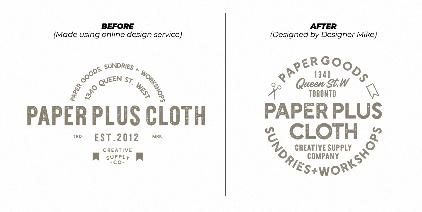
At first, the owner looked into online design templates for a quick solution. But as the business succeeded in its first year, they wanted to take another look at the current logo and update it while still keeping it recognizable to loyal customers.
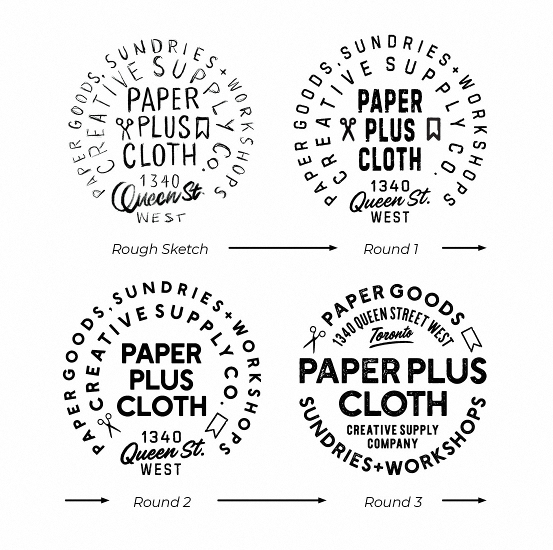
Starting with the current design as a foundation, I focused on enhancing visual form and legibility, particularly at smaller sizes. Organizing letters and spaces, I integrated open scissors and trimmed ribbon icons to evoke crafting elements. Leveraging the shop's licensed brand fonts, I established an aesthetically pleasing hierarchy of information, resulting in a textured imprint with balanced rhythm. This process streamlined clutter, resulting a more cohesive design.
Fonts licensed by client from Hustle Supply Co., via creativemarket.com